


Find Your Rhythm with fitted wardrobes in Dulux’s Colour of the Year 2026
For 2026, Dulux has broken away from tradition. Instead of announcing a single standout shade to define the year ahead, the paint giant has revealed a trio of blues, collectively named Rhythm of Blues.
Each of the three colours – Mellow Flow, Free Groove and Slow Swing – is designed to reflect a different pace of life, giving you more flexibility in how you design your living space. Mellow Flow is a gentle, airy blue with a calming serenity, Free Groove is playful and dynamic, while Slow Swing is a rich, inky hue with a comforting, cocooning feel. Together, they create a versatile spectrum that can work across the home, whether you’re looking for lightness, energy or depth.
But how do you actually use these colours at home — and more importantly, how do you make them work in real, everyday spaces?
According to designer Mia Poulton at My Fitted Bedroom: “The key with a palette like this is not to overthink it. Each shade has its own personality, so it’s really about choosing what you want the room to feel like first — calm, energised, or cocooned — and building from there.”
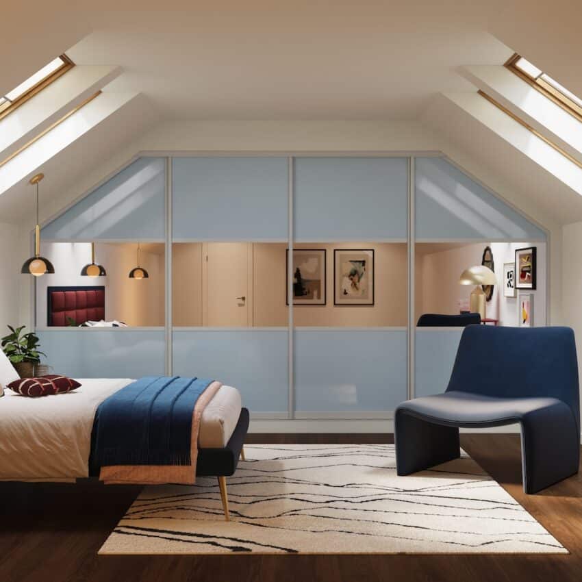
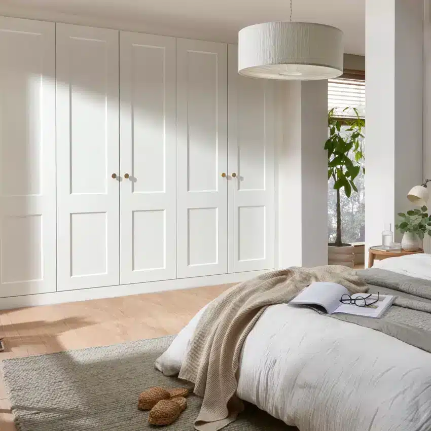
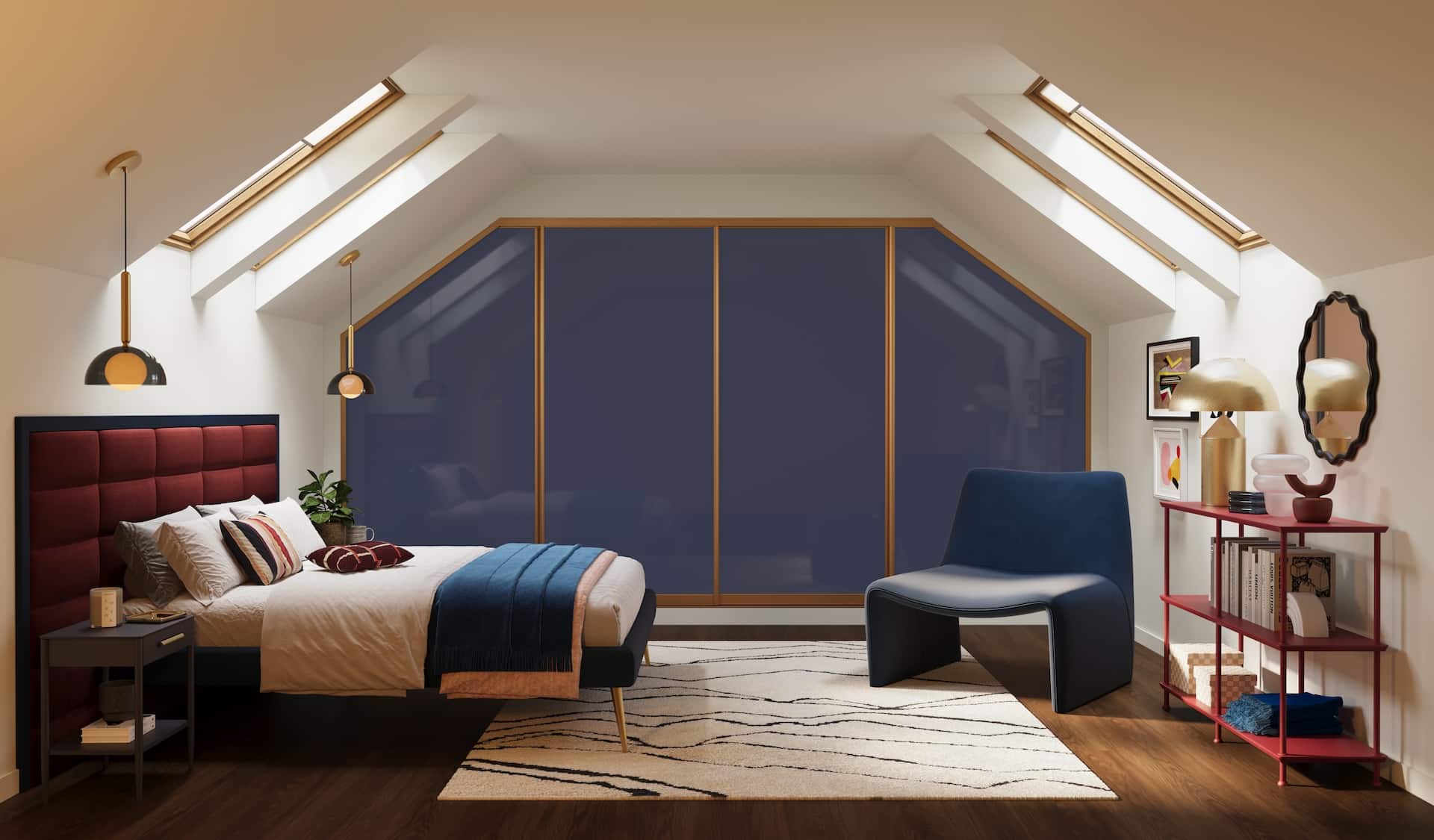
A Bedroom That Breathes
Your bedroom should feel like a relaxing sanctuary where you can actually switch off. And Mellow Flow is the perfect shade for this. Its light, sky-like quality instantly softens a space, helping you unwind at the end of the day. Used on all four walls, it creates a calming backdrop, but it’s equally effective as a feature wall behind fitted wardrobes or a statement headboard.
Pair it with natural textures – linen bedding, wicker baskets, warm oak or walnut furniture — to keep the look grounded. Gentle metallics, such as a brass bedside lamp or a brushed gold mirror, will stop it from feeling too pared-back.
“Lighter blues like Mellow Flow are ideal for bedrooms because they don’t dominate the space,” Mia explains. “They sit quietly in the background, which is exactly what you want in a room designed for rest.”
This is especially effective in UK homes, where natural light can be limited — softer tones help reflect light and keep the room feeling open.
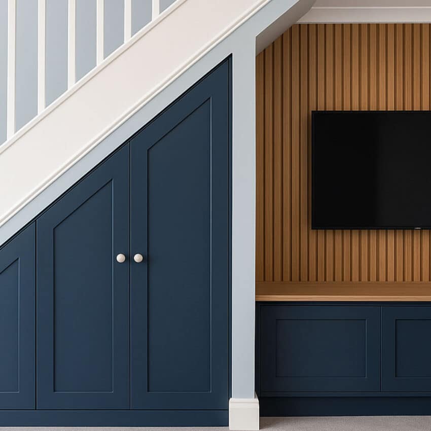
Energy in the Everyday
Free Groove is the perfect choice around the home from bedrooms to under stairs cabinets and utility / boot rooms. Its bold vibrancy instantly energises a space that’s more functional than decorative.
Try it on cabinetry or panelling, keeping the surrounding walls neutral to let the colour sing. Add woven storage baskets in sunny yellows or earthy greens, a patterned tiled floor, or a playful runner rug to echo the sense of fun. The effect? A room that feels as uplifting as it is practical – a place that greets you with positivity every time you step through the door.
“With stronger colours like Free Groove, it’s about where you use them,” says Mia. “Keeping the surrounding space neutral stops it from feeling overwhelming, while still letting the colour do its job.”
The result is a space that feels practical — but still full of personality.
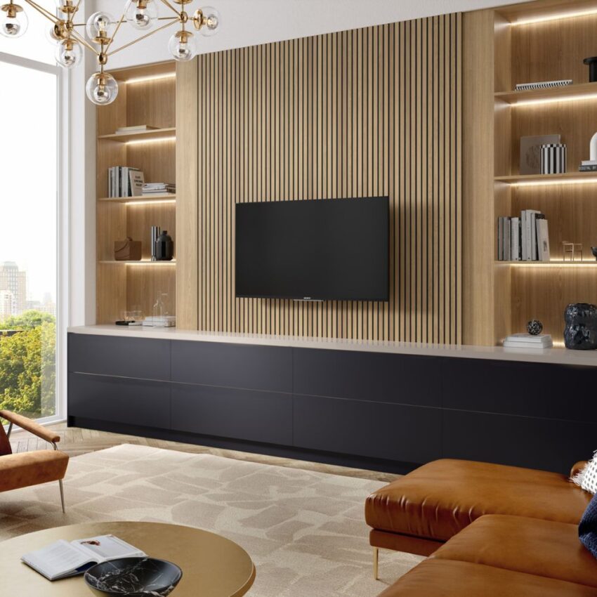
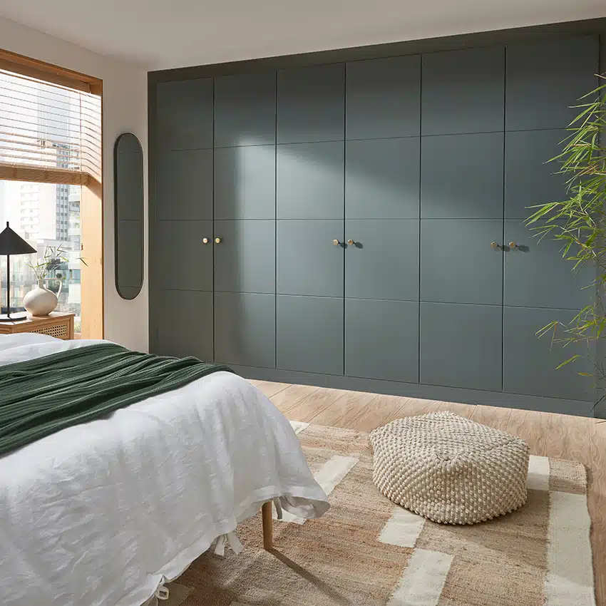
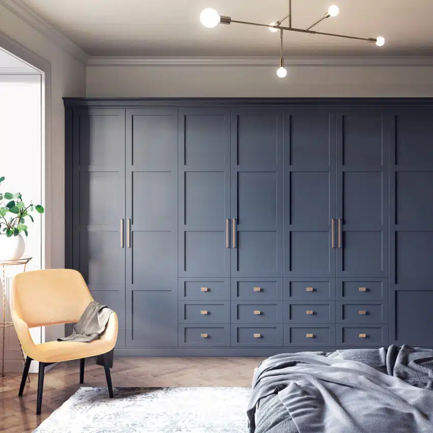
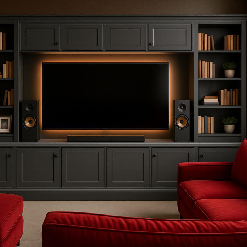
Living Room Luxe
When it comes to the living room, Slow Swing takes centre stage. This deep, velvety blue has a richness that makes a room feel instantly more intimate. Use it on a feature wall behind a fitted media unit or across alcoves to frame shelving and storage.
To stop the look from becoming too heavy, pair Slow Swing with lighter neutrals on surrounding walls and soften it with plush textures: think bouclé cushions, velvet armchairs or a woollen throw. Layered lighting is key here too – floor lamps, table lamps and warm LED strips in cabinetry will create depth and warmth, preventing the space from feeling closed in.
“Darker blues can feel incredibly calming, but only if they’re balanced properly,” Mia notes. “It’s about layering in lighter tones and textures so the room doesn’t feel too heavy.”
Done well, it creates a space that feels intimate without being closed in.
Slow Swing Ideas


Free Groove Ideas


Bringing It All Together
What makes this palette so versatile is how effortlessly the three shades flow together. You don’t have to choose just one shade. A bedroom in Mellow Flow, a boot room in Free Groove and a living room in Slow Swing creates a natural progression through the home, each space reflecting a different mood while still feeling connected.
“It’s less about matching everything perfectly,” Mia says, “and more about creating a sense of rhythm as you move through the house.”
These blues also pair beautifully with warm, earthy tones like ochre, sage green, and terracotta, and natural materials like wood and stone. It keeps the overall look feeling timeless rather than trend-led.
Why fitted furniture works so well with colour
One of the biggest challenges with using colour in the home is keeping the space feeling cohesive, especially in rooms with awkward layouts. And that’s where fitted furniture comes in.
“Fitted wardrobes help anchor colour schemes,” Mia explains. “Because they’re built into the space, they make everything feel more intentional — rather than separate pieces competing with each other.”
This is particularly useful in UK homes, where rooms often include alcoves, sloping ceilings, and chimney breasts.
By integrating storage into the architecture of the room, you create a cleaner, more seamless look — regardless of the colour you choose.
“Trends are a great starting point,” Mia concludes, “but the best spaces are always the ones that feel personal. If a colour works for how you live, you’ll never get tired of it.”